Average Boston Apartment Rent Prices by T Stop

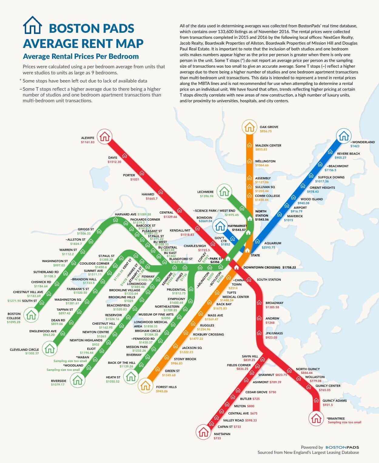
BOSTON, MA: BostonPads.com, a comprehensive digital resource for Boston real estate, published an infographic showing the average per-bedroom rent prices of Boston apartments in nearly every neighborhood in Boston. The infographic looks like an MBTA map with a dollar amount next to the name of each stop. The familiar visual allows readers to easily explore rent price trends in Boston.
BostonPads.com founder Demetrios Salpoglou said: “We are excited to offer an accessible way for our users to observe patterns in housing prices throughout Boston. I hope this graphic provides Bostonians who are choosing a neighborhood to live in with a practical reference of which areas they might consider based on their budgets. I also hope it is an exploratory tool for those interested in housing price trends throughout the Greater Boston Area!”
About the Rent Prices by T Stop Infographic
The graphic shows higher prices in the Downtown, Back Bay, and North End neighborhoods. Stops further along the T lines, like those in Quincy and Allston, indicate more affordable rentals. Higher average prices cluster around universities, hospitals, government buildings, and cultural institutions like museums. Our data source is the BostonPads database, which contains over 133,600 listings as of December 2016. We calculated rent prices from apartments ranging from studios to 5+ bedrooms. The data comes directly from actual rented properties, not listed apartment rental pricing. Prices at some Boston T stops were impacted by an above average number of studios and one-bedroom units. These units trend higher in per bedroom pricing than apartments with more bedrooms. Thus, we present the graphic as an exploratory tool, not a reference for determining prices for individual units.
About BostonPads.com: BostonPads.com is the premier resource on the web for every Boston real estate need. The website features an interactive database of apartments for rent, as well as properties for sale in Boston, and its surrounding areas. The real time apartment database, which is the largest of its kind, is easily searchable by numerous filters. It is powered by over 150 experienced, local Greater Boston real estate agents and refreshed daily by a dedicated staff.
Among BostonPads.com features are free comparative market analyses for property owners, information about construction, renovation, property management and many other services. Boston Pads aims to provide the best resources for every Boston real estate need through innovative technological platforms that make things simple for buyers, sellers, renters, property managers and consumers.
Tags:
6 thoughts on "Average Boston Apartment Rent Prices by T Stop"
How did you set up a distance/walking time cutoff?
This is a great reference tool, nice work! If you guys read the print, you’d see it’s the avg price per bedroom, regardless of the size of the apartment. Of course you’ll pay more for a 1BR or studio than you would if you were splitting a 5BR apartment with roommates, but it’s meant to give you an idea of what you’d pay in each neighborhood. Well done.
This is a pretty awesome infographic gives renters and property owners a good generalized idea about the rental market based on a average price – in many cases you would have to add another $500 or $1500 to these values based on the unit specifics (square footage, luxury building, swanky street address, parking). I think folks need to remember that this only based on average across all unit sizes and if you were to base it on an an average 2 bedroom in say Kenmore the apartment would be around $3100 based on the calculations. There are in fact apartments at these price ranges that do exist in each neighborhood but it can range from a low end dated studio with no amenities to a high end 2 or 3 bed (x the average price + extra $$$). Let’s face it, Boston is expensive and if you take this info at face value you would consider renting with a roommate for city dwellings and consider other suburban areas that are a little further commute but right on the MBTA to save money. Pretty sure they will be releasing more specific infographics based on unit size and area, etc but this is good generalization in my opinion.
This is a pretty awesome infographic that gives renters and property owners a good generalized idea about the rental market based on a average price – in many cases you would have to add another $500 or $1500 to these values based on the unit specifics (square footage, luxury building, swanky street address, living amenities). I think folks need to remember that this only based on average across all unit sizes and if you were to base it on an average 2 bedroom in say Kenmore the apartment would be around $3100 based on the calculations. There are in fact apartments at these price ranges that do exist in each neighborhood but it can range from a crappy low end dated studio to a high end 2 or 3 bed (x the average price + extra $$$). Let’s face it, Boston is expensive and if you take this info at face value you would consider renting with a roommate for city dwellings and consider other suburban areas that are a little further commute but right on the MBTA to save money. Pretty sure they will be releasing more specific infographics based on unit size and area, etc but this is good generalization in my opinion.
Interesting concept, many anomalies including those others have pointed out. There’s no indication how far from a given T stop the sampling went, so the odds are many remote neighborhoods weren’t counted. Adding commuter rail and express bus stops might help with that. And the disparity of numbers makes the graphic seem like a joke — $2,300 per bedroom for Chinatown? But that’s based on a few luxury properties outweighing the others — take the average of 4, 5, 6, 7, 8, and 900, and you’ll see the problem. Guys, use the median value instead of the average! That can ameliorate the effect of extreme outliers and produce a more “typical” value. (In the above example, the average is 155 and the median is 6.5.)
This is an interesting article. It would be nice if they did a follow up article tell you where you’d get the most bang for your buck in each neighborhood…like if I wanted to live in Southie would I be better splitting a 2 or 3 bedroom or can I afford a 1 bedroom or studio there. That would be really helpful.